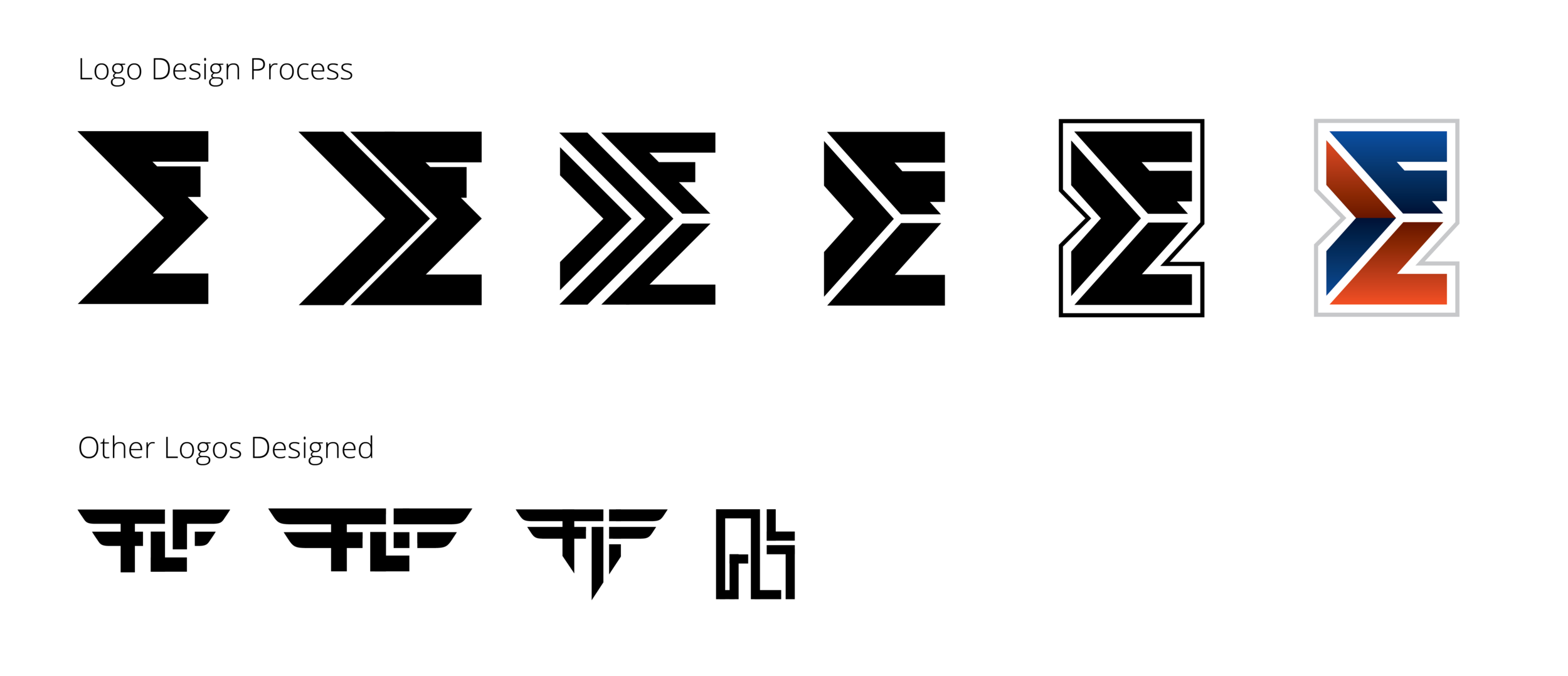
I originally started this logo to resemble an airline logo, with the wings, but felt it didn’t properly represent a logistics company that mainly transports on the ground. Then I liked the incorporation of an arrow, so developed the logo working around that. The client had requested to utilize the “F” (Fritz) and the “L” (Logistics) so added the lettering around the arrow.


